Share this post
This is some text inside of a div block.
Copied!


Back to all posts
Learn how to create LinkedIn carousels that stand out, share your expertise and build a stronger personal brand with content people want to read


Published on
June 11, 2026
You don't need to post every day to build a name for yourself on LinkedIn. Some of the most recognized voices in our industry post once every week or two, but when they do show up, it feels intentional. The content looks like theirs and it sounds like theirs.
One of the easiest ways to make the leap from LinkedIn poster to thought leader is with carousels. If you've been sticking to text posts or the occasional photo, this is your sign to try something a little more visual.
Carousels are consistently the best performing format on LinkedIn right now. LinkedIn's own platform data puts the average carousel engagement rate at 6.6 percent, well above what text posts or single images typically bring in. The reason is that swiping through slides keeps people on your post longer, and the algorithm notices that.
That said, the format itself has been shifting. If you've scrolled LinkedIn lately, you may have noticed carousels look a bit different than they used to. The first two frames now show up side by side, and the overall size has gotten smaller, especially on mobile. Social media strategist Sam Oliver broke this down well in a recent post, and it's worth a read if you want the full picture of what changed. The short version is that your opening frames matter more than ever now. Think of your first slide as the headline and your second as the reason to keep swiping, almost like a one two setup rather than a single big reveal.
You don't need a design background or a subscription to make this work.
Canva's free plan is more than enough. Once you're in, search "LinkedIn carousel" in the template bar and you'll find dozens of pre-built layouts sized correctly for the platform. Pick one that feels close to what you're picturing and make it yours from there.
Here are some great examples:
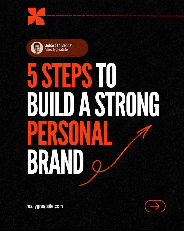
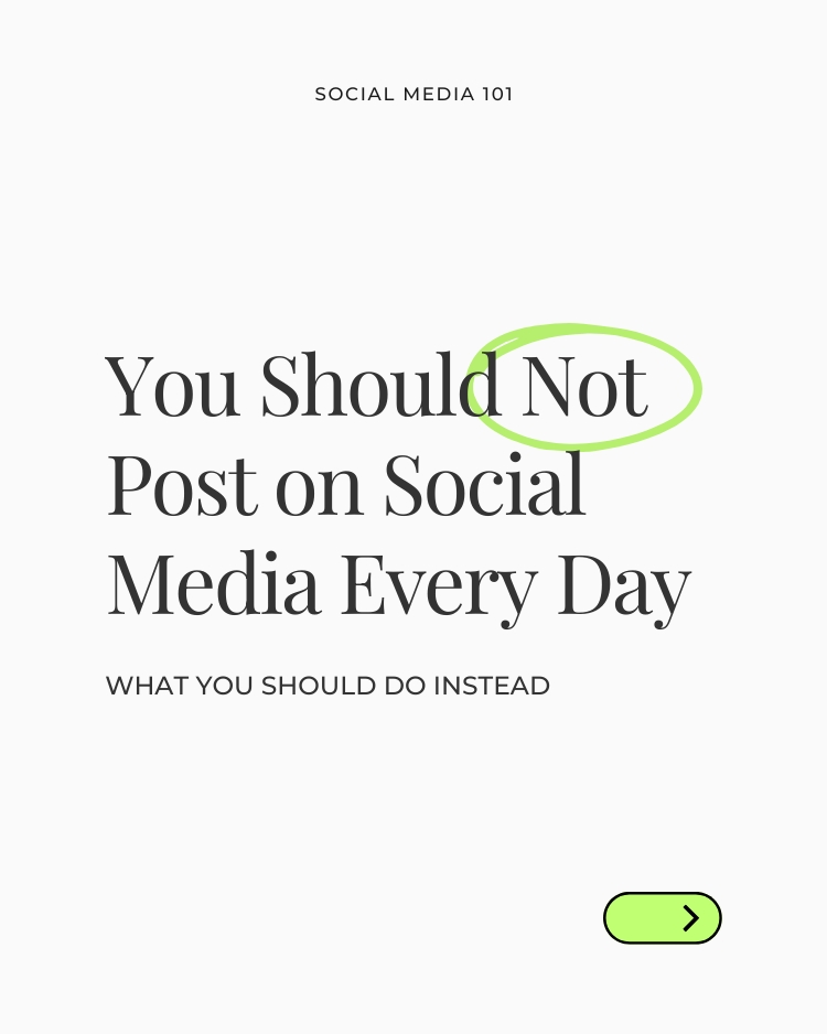


This is where a lot of people go wrong. They find a template they like, use it once, then switch to a completely different font and colour palette the next time they post. This can end up looking scattered instead of an intentional choice for your personal brand.
Instead, treat your carousel style the way a brand treats its visual identity:
If you want a model to look at, take a look at how Altis approaches its own LinkedIn presence. The colours, the fonts and the tone stay consistent post after post, and that consistency is exactly what makes content feel recognizable in someone's feed even before they read a word.
Better yet, pick one carousel format you're comfortable with, whether that's a numbered list, a step by step breakdown or a simple story arc, and reuse that same structure. Change the topic and the copy each time, but keep the bones the same. It saves you time and it makes your content instantly recognizable as yours.
It helps to see the difference side by side. Here’s an example of a strong opening slide:
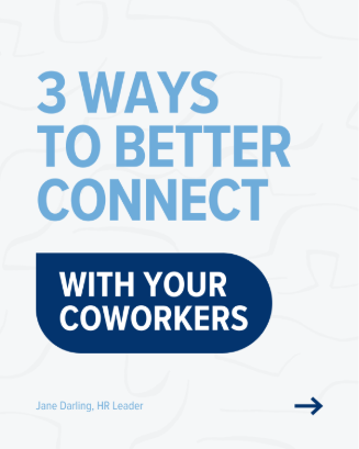
A strong carousel usually has:
Here’s an example of a weaker opening slide:
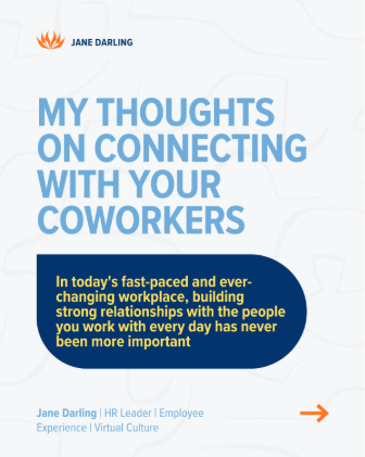
A weak carousel tends to:
The best carousels say less per slide, but each has strong impact.
Once you've chosen your look, a handful of small adjustments go a long way.
Keep your fonts on the larger side. It might feel like you're shouting, but on a small screen, bigger text is what actually gets read.
Trim the copy on each slide down to the essentials. If someone has to zoom in to read it, they've probably already moved on.
Design in a 4:5 ratio rather than a square. It gives you more room to work with and fits the way LinkedIn displays carousels today.
Save your best insight or your supporting detail for the caption rather than cramming it onto a slide. This also helps your content get picked up and indexed properly, which matters more and more as search and AI tools start pulling from LinkedIn content directly.
Design can be the fun part, copy on the other hand can make us pause. This is where a tool like Claude or ChatGPT can save you time and help you get creative, as long as you use it to sharpen your ideas rather than replace your voice.
A prompt to try:
"Here's my caption for a LinkedIn carousel about [topic]. Can you help me turn this into five to seven short slide headlines that build on each other, using plain and conversational language? I want keep my warm and conversational voice, while still having a strong impact on every slide."
The goal is a first draft you can shape, not a finished product you publish as is. Always read it back before you post to ensure it’s accurate and truly sounds like you.
You don't need to post constantly to be seen as a thought leader on LinkedIn, and you don't need carousels to do it either. But if you're looking for a way to stand out a little more and build a personal brand people start to recognize, this is one of the easier ways to get there. A visual identity you reuse, a structure you don't have to reinvent every time, and copy that still sounds like you even with a little help. It's also just a nice creative outlet if you're someone who enjoys that side of things. Don't be afraid to give it a try and see how it works for you.
Altis is a Canadian-owned staffing firm supporting organizations across the private and public sectors. We focus on relationship-driven recruitment, clear process and consistent delivery, helping employers hire with confidence and professionals build meaningful careers.
.jpg)